 Saudi
Saudi Dubai
Dubai Kuwait
 Toronto
 London, UK
 India
India
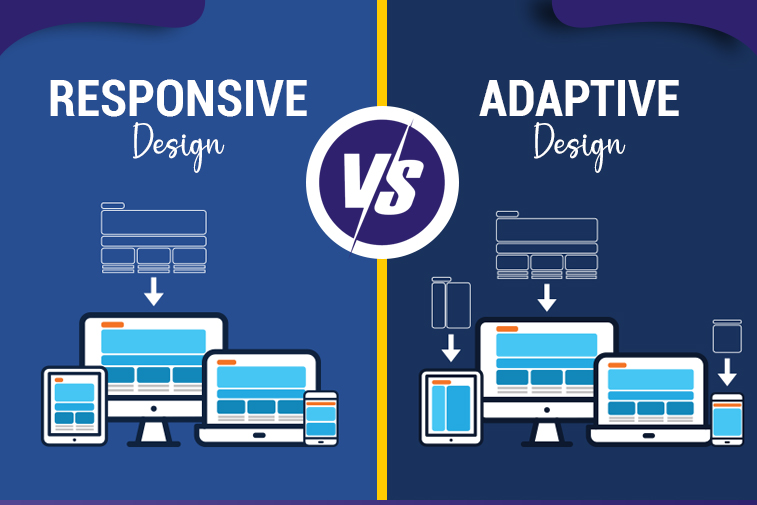
Responsive vs Adaptive Design: Which is Better for Ecommerce?
Every year, businesses lose millions in revenue because their ecommerce websites fail to deliver seamless experiences across devices. A customer browses products on their smartphone during lunch, but when the site loads slowly or displays incorrectly, they abandon their cart and move to a competitor. This scenario plays out thousands of times daily, highlighting a critical decision every ecommerce business must make: choosing the right web design approach.
Today, mobile devices account for over 60% of online shopping traffic, yet many businesses struggle to convert these visitors into customers. The problem isn't just having a mobile presence—it's about having the right kind of mobile optimization. This is where the responsive vs adaptive design debate becomes crucial for your bottom line.
Understanding the web design comparison between these two approaches helps business owners make informed decisions that directly impact conversion rates, user satisfaction, and long-term scalability. The choice you make today will influence your ecommerce performance for years to come, affecting everything from customer acquisition costs to lifetime value.
Understanding Responsive Web Design
Responsive web design represents a fluid approach where your website automatically adjusts its layout, images, and content to fit any screen size. Think of it like water taking the shape of its container—the design flows and adapts seamlessly whether viewed on a 27-inch desktop monitor or a 5-inch smartphone screen.
How Responsive Design Works
At its core, responsive design uses flexible grids, proportion-based layouts, and CSS media queries to create a single website that serves all devices. Instead of building separate versions for different screens, developers create one codebase that intelligently responds to viewport dimensions.
Key technical components include:
- Fluid grid layouts using percentage-based measurements rather than fixed pixels
- Flexible images that scale proportionally within their containers
- CSS media queries that apply different styling rules based on screen characteristics
- Single HTML structure serving identical content across all devices
- Breakpoints that trigger layout adjustments at specific screen widths
When a user visits your responsive ecommerce site, their browser detects the screen size and automatically applies the appropriate CSS rules. Navigation menus collapse into hamburger icons on mobile, product grids shift from four columns to one, and images resize without losing quality or breaking the layout.
Real-World Business Scenario
Consider an online furniture retailer with a responsive website. A customer discovers the site through Google search on their smartphone while commuting home. They browse several sofas, add one to their cart, but don't complete the purchase. Later that evening, they return to the site on their tablet while watching TV. The cart contents persist, the browsing history remains accessible, and the experience feels familiar despite the different device. Finally, they complete the purchase the next morning on their work computer during a break. Throughout this cross-device journey, the responsive design ensures continuity and consistency.
Advantages for Ecommerce Operations
Cost efficiency: Responsive design requires building and maintaining only one website, significantly reducing initial development costs and ongoing maintenance expenses. Your content management team makes updates once, and changes appear across all devices instantly.
SEO benefits: Google explicitly recommends responsive design and ranks these sites favorably in search results. With a single URL structure, all backlinks point to one version, consolidating your domain authority. Search engines can crawl and index your content more efficiently, improving visibility.
Future-proof scalability: As new devices emerge with varying screen sizes—foldable phones, larger tablets, smartwatches—your responsive site adapts automatically without requiring redesign. This protects your technology investment as the device landscape evolves.
Simplified analytics: Tracking user behavior becomes straightforward when all traffic flows through one site. You avoid the complexity of reconciling data from separate mobile and desktop versions, enabling clearer insights into customer journeys.
Understanding Adaptive Web Design
Adaptive web design takes a different approach by creating multiple fixed-width layouts tailored for specific device categories. Rather than one fluid design, you're building several distinct versions of your site, typically targeting six common breakpoints: 320px, 480px, 760px, 960px, 1200px, and 1600px.
How Adaptive Design Works
When visitors arrive at your adaptive ecommerce site, server-side or client-side detection identifies their device type and screen dimensions. The system then serves the pre-built layout version that best matches their device specifications. Each layout is independently designed and optimized for its target screen size.
Key technical components include:
- Multiple static layouts designed specifically for target device categories
- Server-side device detection mechanisms for optimal performance
- Client-side detection as an alternative implementation approach
- Device-specific templates and asset delivery
- Distinct user experiences tailored to different device contexts
- Progressive enhancement layers for unsupported devices
Unlike responsive design's continuous adaptation, adaptive layouts "snap" to predetermined widths. This gives designers precise control over how every element appears at each breakpoint, allowing for dramatically different experiences across devices rather than scaled versions of the same layout.
Real-World Business Scenario
Imagine a high-end jewelry ecommerce business using adaptive design. Desktop users see a sophisticated interface with large product images, detailed comparison tables, 360-degree product viewers, and extensive filtering options. The experience emphasizes luxury browsing with rich visual content. Mobile users receive a streamlined version focusing on quick search, simplified navigation, and touch-optimized product cards with one-tap purchasing. Tablet users get a middle ground with swipeable galleries and moderate feature sets. Each experience is purpose-built for how customers actually shop on that device type.
Advantages for Ecommerce Operations
Precise optimization: Adaptive design enables granular control over user experience at each breakpoint. You can prioritize different features, content hierarchies, and calls-to-action based on device-specific user behaviors and conversion patterns.
Performance advantages: By serving device-appropriate assets and code, adaptive sites often achieve faster load times. Mobile users don't download desktop-only JavaScript libraries or high-resolution images intended for larger screens, conserving bandwidth and improving speed.
Device-specific features: You can leverage unique device capabilities more effectively. Desktop users might access advanced product configurators, while mobile users get simplified swipe-based browsing and one-click mobile wallet payments optimized for touchscreens.
Conversion optimization: When analytics reveal that mobile users behave differently than desktop users—perhaps browsing but not buying—adaptive design lets you create distinct conversion funnels optimized for each context.
The Critical Comparison: Responsive vs Adaptive Design
Understanding the practical differences between responsive and adaptive design helps you evaluate which mobile friendly design approach aligns with your business objectives, technical capabilities, and customer needs. This web design comparison extends beyond technical specifications to encompass strategic business implications.
Development Investment and Timeline
Responsive design typically requires:
- 30-50% lower initial development costs due to single codebase
- Faster launch timelines, often 2-4 weeks quicker than adaptive approaches
- Smaller development teams with fewer specialized skill requirements
- More accessible entry point for startups and small businesses
- Predictable project scope with fewer complexity variables
Adaptive design typically requires:
- 40-70% higher initial investment for multiple layout versions
- Extended development timelines to design and test each breakpoint
- Larger teams with expertise in device-specific optimization
- Greater project management complexity coordinating parallel development
- Higher upfront costs that may deliver ROI through conversion improvements
For a small ecommerce startup with limited capital, responsive design's lower barrier to entry makes launching feasible. A large enterprise with millions in annual mobile revenue might justify adaptive design's premium cost if testing shows even small conversion improvements generate substantial returns.
Maintenance Complexity and Long-Term Costs: Responsive vs Adaptive Design
Responsive design maintenance:
- Single update workflow applies changes across all devices simultaneously
- Reduced quality assurance burden with one codebase to test
- Lower ongoing operational costs benefit smaller teams
- Simplified content management without device-specific considerations
- More efficient bug fixes affecting all platforms at once
Adaptive design maintenance:
- Updates require testing and potential adjustments across multiple layouts
- Higher QA costs ensuring consistency across all breakpoints
- Increased risk of inconsistencies between device versions
- More complex content management requiring device-awareness
- Potential for layout-specific bugs requiring separate fixes
A business running frequent promotional campaigns benefits from responsive design's efficiency—updating one banner file versus creating and managing six device-specific versions. However, an enterprise with dedicated development resources might accept higher maintenance costs if adaptive optimization significantly outperforms responsive alternatives.
Search Engine Optimization Impact: Responsive vs Adaptive Design
Responsive design SEO advantages:
- Single URL structure consolidates all ranking signals and backlinks
- Preferred method in Google's mobile-first indexing strategy
- Eliminates duplicate content concerns automatically
- Simpler implementation of structured data markup
- Easier management of canonical URLs and redirects
- Reduced crawl budget requirements for search engines
Adaptive design SEO considerations:
- Requires careful configuration to avoid duplicate content penalties
- May use separate URLs needing proper canonical tag implementation
- Dynamic serving requires additional server configuration
- More complex but achievable with expert implementation
- Performance improvements can enhance user engagement signals
- May benefit from device-specific content optimization
For businesses where organic search drives primary traffic acquisition, responsive design's SEO simplicity provides competitive advantage. Companies with strong brand recognition and direct traffic sources might prioritize adaptive design's performance benefits over marginal SEO differences.
User Experience and Conversion Performance: Responsive vs Adaptive Design
Responsive design experience:
- Consistent brand presentation builds familiarity and trust
- Seamless cross-device transitions as users switch platforms
- May load unnecessary assets on mobile, affecting performance
- Single experience means no device-specific optimization
- Predictable functionality across all platforms
Adaptive design experience:
- Device-optimized interfaces maximize usability per platform
- Superior performance through targeted asset delivery
- Potential confusion if experiences differ too dramatically
- Better accommodation of touch versus cursor interaction patterns
- Customized conversion funnels for different user contexts
Analytics data should drive this decision. If your mobile conversion rate significantly lags desktop despite equivalent traffic quality, adaptive design's device-specific optimization might address the gap. If conversion rates are consistent across devices, responsive design's simpler approach may suffice.
Key Decision Factors for Ecommerce Businesses: Responsive vs Adaptive Design
Choosing between these ecommerce website design approaches requires evaluating your specific business context against several critical factors. No universal answer exists—the right choice depends on your unique circumstances.
Budget and Resource Availability
Consider responsive design when:
- Initial development budget is limited or constrained
- Technical team is small or outsourced
- Maintenance resources are minimal
- Speed to market is critical for competitive positioning
- You need to prove market fit before larger investments
Consider adaptive design when:
- Substantial development budget allows comprehensive optimization
- In-house technical team has specialized mobile expertise
- Ongoing maintenance resources are adequate for complexity
- Market position is established with proven product-market fit
- Marginal conversion improvements justify premium investment
Product Complexity and Catalog Size
Responsive design suits:
- Straightforward product catalogs with standard attributes
- Simple checkout processes without complex configuration
- Products not requiring extensive comparison features
- Standard ecommerce functionality without custom features
- Consistent product presentation across all devices
Adaptive design suits:
- Complex products requiring configurators or visualization tools
- Extensive catalogs benefiting from device-specific navigation
- Products needing detailed comparison across multiple attributes
- Custom features leveraging device-specific capabilities
- Situations where browsing and buying behaviors differ dramatically by device
A fashion retailer selling standard clothing items likely succeeds with responsive design. An industrial equipment supplier with complex product specifications and configuration tools might justify adaptive design's granular control.
Target Audience and Device Usage Patterns: Responsive vs Adaptive Design
Analyze your analytics data for:
- Traffic distribution across device categories
- Conversion rate differences between mobile, tablet, and desktop
- Cart abandonment patterns segmented by device
- Average order value variations across platforms
- User engagement metrics including bounce rate and time-on-site
- Device switching patterns within customer journeys
If mobile users represent 70% of traffic but only 20% of revenue, that gap signals potential for adaptive optimization. If conversion rates are proportional to traffic distribution, responsive design's consistency may be optimal.
Technical Team Capabilities
Assess your team's ability to:
- Maintain complex codebases with multiple layout versions
- Implement sophisticated device detection mechanisms
- Conduct thorough quality assurance across numerous breakpoints
- Handle increased deployment complexity
- Troubleshoot platform-specific issues efficiently
Responsive design's technical simplicity makes it more manageable for smaller teams or businesses relying on external agencies. Adaptive design demands strong internal technical capabilities or long-term agency partnerships with deep system knowledge.
How Sapphire Technologies Helps
Sapphire Technologies approaches the responsive vs adaptive design decision through comprehensive discovery that prioritizes your business outcomes over technical preferences. We begin by analyzing your current traffic patterns, conversion metrics, and user behavior data to understand how customers actually interact with your ecommerce platform across devices.
Our discovery process includes:
- Detailed analytics review identifying device-specific performance gaps
- Competitive analysis revealing industry best practices and opportunities
- User research understanding your customers' cross-device shopping behaviors
- Technical assessment of your current infrastructure and capabilities
- Budget and timeline evaluation aligning technology choices with resources
- Risk analysis identifying potential challenges with each approach
Based on these insights, we recommend the design strategy that genuinely serves your business objectives. For startups needing rapid market entry with limited budgets, we often implement responsive designs that prioritize speed and cost-efficiency while maintaining quality. For established enterprises with clear data showing device-specific optimization opportunities, we develop sophisticated adaptive solutions that maximize conversion performance.
Our implementation capabilities include:
- Custom responsive designs with advanced performance optimization
- Multi-breakpoint adaptive platforms with device-specific experiences
- Hybrid approaches combining responsive fluidity with adaptive enhancements
- Progressive web applications delivering app-like mobile experiences
- Comprehensive testing across real devices and network conditions
- Ongoing monitoring and optimization based on performance data
We don't simply build and disappear. Our team provides continuous support as your business evolves, monitoring site performance, analyzing user behavior patterns, and recommending enhancements. When new devices emerge or user preferences shift, we proactively suggest adjustments that maintain competitive advantage.
Our optimization services include:
- Performance monitoring tracking load times and conversion metrics
- A/B testing comparing design variations for continuous improvement
- Accessibility audits ensuring compliance and inclusive experiences
- SEO optimization maximizing organic search visibility
- Analytics implementation tracking meaningful business metrics
- Strategic guidance adapting to market changes and technology evolution
Whether you choose responsive design, adaptive design, or a hybrid approach, Sapphire Technologies ensures your ecommerce platform delivers exceptional experiences that convert visitors into customers across every device.
Making Your Decision: Practical Steps
Start by gathering concrete data about your current situation rather than making assumptions. Export device-segmented analytics covering at least three months to identify patterns in traffic, conversion, and revenue distribution. Calculate your mobile conversion gap—the difference between mobile traffic percentage and mobile revenue percentage—to quantify optimization potential.
Create a decision framework by answering:
- What percentage of traffic comes from mobile versus desktop?
- How do conversion rates compare across device categories?
- What is your available budget for initial development?
- What are your ongoing maintenance resource capabilities?
- How complex are your products and purchase processes?
- What timeline constraints affect your launch plans?
- What competitive advantages does superior mobile experience provide?
Test assumptions before committing significant resources. Consider developing prototypes of both approaches for core user flows, then conducting usability testing with representative customers. Real user feedback often reveals insights that analytics and assumptions miss.
Evaluate the total cost of ownership beyond initial development. Factor in ongoing maintenance costs, update frequency requirements, testing complexity, and potential optimization opportunities. A more expensive initial investment might cost less over three years if maintenance efficiency and performance improvements offset the premium.
Risk mitigation strategies:
- Start with responsive design, then selectively add adaptive enhancements for high-impact pages
- Implement responsive design with plans to transition specific sections to adaptive as budget allows
- Build adaptive layouts only for primary device categories initially, expanding coverage over time
- Use progressive enhancement ensuring basic functionality works everywhere
- Plan iterative improvements based on performance data rather than complete redesigns
Responsive vs Adaptive Design: Frequently Asked Questions
What is the main difference between responsive and adaptive web design?
Responsive design uses flexible layouts that fluidly adjust to any screen size, while adaptive design creates multiple fixed layouts for specific device widths.
Which approach is better for ecommerce SEO performance?
Responsive design offers SEO advantages with single URL structure and Google's recommendation, though adaptive design achieves strong results with proper technical implementation.
Does adaptive design cost significantly more than responsive design?
Yes, adaptive design typically costs 40-70% more initially due to multiple layouts, though device-specific optimization may improve conversions and justify the investment.
Can responsive designs achieve fast mobile load times?
Yes, properly optimized responsive designs achieve excellent mobile performance through techniques like responsive images, lazy loading, and conditional asset delivery.
Which design approach better accommodates future devices?
Responsive design automatically adapts to new screen sizes without updates, while adaptive design may require modifications for significantly different device categories.
How do I know which approach my business needs?
Analyze your device traffic distribution, conversion rate gaps, budget constraints, product complexity, and technical capabilities to determine the optimal approach.
Can I switch from responsive to adaptive design later?
Yes, though switching requires substantial development work. Many businesses start responsive and selectively add adaptive elements to high-impact areas over time.
Conclusion
The responsive vs adaptive design decision represents more than a technical choice—it's a strategic business decision affecting customer acquisition, conversion performance, and long-term scalability. Responsive design offers cost-effective simplicity, strong SEO foundations, and automatic future-proofing that serves most small to medium businesses exceptionally well. Adaptive design provides granular optimization control and superior device-specific performance that justifies premium investment for enterprises with resources and data supporting device-targeted optimization.
Your optimal path depends on honest assessment of your business context, not industry trends or competitor choices. Consider your budget realities, technical capabilities, product complexity, and most importantly, how your actual customers behave across devices. The best design approach is the one you can implement excellently and maintain sustainably while meeting real customer needs.
Success in ecommerce ultimately comes from delivering experiences that eliminate friction in the buying journey regardless of device. Whether you achieve this through responsive fluidity or adaptive precision matters less than implementation quality and ongoing optimization commitment. Focus on understanding your customers deeply, building solid technical foundations, and continuously improving based on performance data. Make the decision that positions your business for sustainable growth while remaining adaptable as technology and customer expectations evolve.